Printing Inversion No. 3
23/08/10 11:52 Filed in: Pellinore Press
I thought I’d try to show something a little different, so here is a bit of the work involved to get a print with large areas of dark color to print evenly. After the block is printing pretty well (on our press, this is achieved through a balance of ink roller height, amount of ink, and adjustment of the bed for amount of impression), there will usually be some areas that are still not as dense or dark as desired.
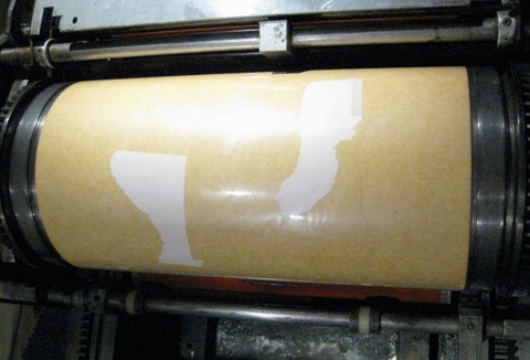
Often these are large flat areas of color that require more impression because the force is more distributed. But, printing problems may also result from inconsistencies in the block itself. If there is a corner or edge of the block that is obviously low, pieces of newsprint or tracing paper carefully placed beneath these areas will help. For more precise results, packing the cylinder is necessary. Running a proof with a backing sheet of newsprint (thin), or tracing paper (very thin) can help determine how much packing is necessary. When this is established, the proof is marked and the paper to be used for packing is torn or cut to shape, but with a tail or edge available to tape to the tympan cover. Before mylar tympans, a system of pinholes was used to place the packing beneath the top sheet.
Here is the proof marked with pencil for light spots.
Printing directly on the mylar tympan is an easy way to see exactly where the packing needs to be placed. With the tympan loosened the packing can be taped to the underside of the tympan. I should have gotten a shot of this, but only have it completed.
I’ll be uploading images of the completed poster soon.
Read More...
0 Comments
Gradation Woodcut
10/08/10 13:50 Filed in: Pellinore Press
Although I enjoy the graphic qualities of woodcuts, I miss the softness and tonality of my monotypes. I wondered if there was some way to bring some of this to the woodcuts. I had undertaken little experiments with shaving very small parts of the block, but tools remove too much material without enough control. I decided to create a practice block and sand parts of it. I learned more recently that Rockwell Kent, a 19th century wood engraver, would sand portions of his blocks where he planned to have thin lines or details. In this way they wouldn’t receive impression they didn’t need (thin lines will be the first to print black).
Since the tonality is in the block itself, printing the tone should be repeatable enough to create an edition, given a press with small tolerances and careful monitoring of the ink. With its adjustable bed, the 15-21 allows for very slight changes in impression without having to make underlays or overlays and worked well to fine tune the tone while maintaining some blacks.
Here is the proof from the block after carving, but without any sanding.
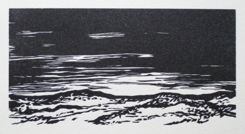
This is after several timid rounds of sanding and proofing, stripping the block, sanding and proofing… Many small details, the shallower cuts in the wood, disappear the more the block is sanded.
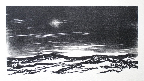
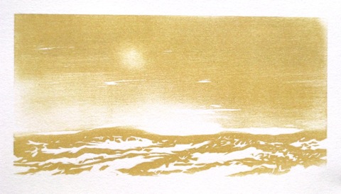
There were some interesting things happening, but it wasn’t there yet. My monotypes were in color, which gave them a softer feel, so I tried printing the landscape in a muted hue. I think at this stage I might still prefer the unsanded proof, but I want to take it to its conclusion.
I think it needs a second color, so I’m going to continue with it as a reduction cut. Read More...
Since the tonality is in the block itself, printing the tone should be repeatable enough to create an edition, given a press with small tolerances and careful monitoring of the ink. With its adjustable bed, the 15-21 allows for very slight changes in impression without having to make underlays or overlays and worked well to fine tune the tone while maintaining some blacks.
Here is the proof from the block after carving, but without any sanding.
This is after several timid rounds of sanding and proofing, stripping the block, sanding and proofing… Many small details, the shallower cuts in the wood, disappear the more the block is sanded.
There were some interesting things happening, but it wasn’t there yet. My monotypes were in color, which gave them a softer feel, so I tried printing the landscape in a muted hue. I think at this stage I might still prefer the unsanded proof, but I want to take it to its conclusion.
I think it needs a second color, so I’m going to continue with it as a reduction cut. Read More...