Pocket Books
14/05/11 21:13 Filed in: Pellinore Press
We try to employ as many items as possible which would otherwise be waste. This applies primarily to paper, such as that used for proofing, cleaning blocks, or smaller pieces trimmed from larger projects. One of the ways we do this is to use proofs for “stripping” blocks, and, ultimately for the covers of pocket books.
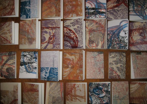
After printing, the block is stripped by printing onto several sheets of the same or slightly thicker paper to remove excess ink. The same sheet can be used for this purpose for quite some time. In doing so, layers of images are formed. These can be fairly dense prints, if run directly after the last print, or mere ghosts when the block has already been stripped a few times. When they start to get interesting we’ll set them aside to be the covers for the pocket books.
The first step is to coat the covers with PVA Size to make them more durable. Bookcloth is then glued to the insides of the covers, which increases their strength and gives color to the interior of the book. The covers are “nipped” in the book press to ensure even adhesion. The covers will dry flat beneath weight.
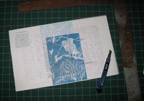
Here a cover awaits trimming to the initial size of the pages.
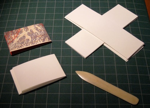
These pages have been cut to size and arranged in signatures, one for each book. They must be folded individually. A bone folder assists in obtaining clean folds.
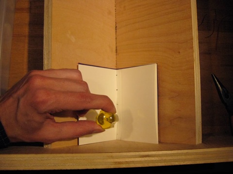
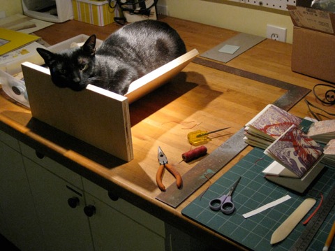
Pages are mated to covers and the sewing stations are pierced using a cradle to help keep everything in place. Below, Queequeg is putting the cradle to a different sort of use.
The books are sewn with colored, waxed thread using a pamphlet stitch of 3 or 5 holes depending on the length of the spine. Finally, the head, tail, and fore edge are each trimmed in the guillotine cutter to ensure clean edges. Here are some finished books!
 Read More...
After printing, the block is stripped by printing onto several sheets of the same or slightly thicker paper to remove excess ink. The same sheet can be used for this purpose for quite some time. In doing so, layers of images are formed. These can be fairly dense prints, if run directly after the last print, or mere ghosts when the block has already been stripped a few times. When they start to get interesting we’ll set them aside to be the covers for the pocket books.
The first step is to coat the covers with PVA Size to make them more durable. Bookcloth is then glued to the insides of the covers, which increases their strength and gives color to the interior of the book. The covers are “nipped” in the book press to ensure even adhesion. The covers will dry flat beneath weight.
Here a cover awaits trimming to the initial size of the pages.
These pages have been cut to size and arranged in signatures, one for each book. They must be folded individually. A bone folder assists in obtaining clean folds.
Pages are mated to covers and the sewing stations are pierced using a cradle to help keep everything in place. Below, Queequeg is putting the cradle to a different sort of use.
The books are sewn with colored, waxed thread using a pamphlet stitch of 3 or 5 holes depending on the length of the spine. Finally, the head, tail, and fore edge are each trimmed in the guillotine cutter to ensure clean edges. Here are some finished books!
Read More...0 Comments
There is No Exception to the Rule – Adding a Second Block
12/05/11 11:11 Filed in: Pellinore Press | After Darwin
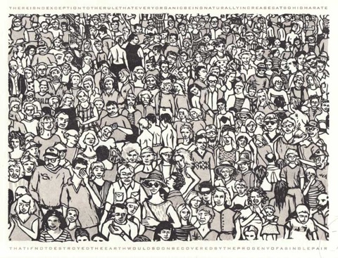
After carving the key block for “There is No Exception to the Rule” I did a lot of proofing followed by hand coloring to figure out where to add color. I originally envisioned the image with multiple color blocks, but the color seemed to fragment the crowd more than I wanted. Using a range of grey tones unified the crowd, so that it read first as a mass and then as a group of individual figures.
I also wanted to try a variation on a technique used by Ilse Buchert Nesbitt of The Third and Elm Press. She uses different thicknesses of packing material to print a range of values from a single woodblock. There is a very good explanation of her process here.
Here is a simplified overview of the process I used:
1. I used ink wash on a proof of the key block to determine where I wanted gray, then transferred the image from the key block on to a second block and inked the grey areas. Everything that is not inked was then carved away.
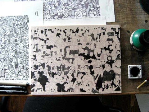
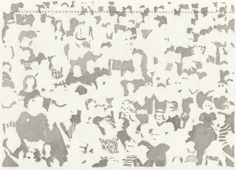
2. Proofing: After carving, the grey block is printed (proofed) alone and with the key block. (You can also see that I later used the same sheet to proof the type) The grey in these proofs is all basically the same value, with some variation due to the fact that I was inking by hand and using a very transparent ink.
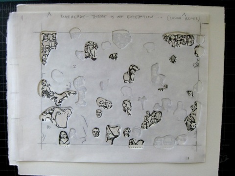
3. Preparing the Packing Material (Makeready): I laid a sheet of tracing paper over my proof and traced the areas where I wanted to adjust the value of the grey. I then assembled a stack of 6 sheets of tracing paper. Using my traced marks as a guide, I cut through all of the sheets where I wanted the lightest values (less impression), and through half the sheets for a middle value (moderate impression). The places where I cut away nothing receive the most impression and print as the darkest value.
Here is the finished packing laid over a completed print. The areas that show through are the palest shades of grey in the final image because they receive the least impression when printing.
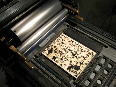
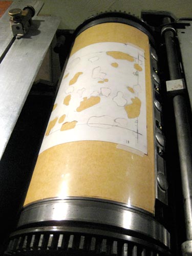
4. Printing the Grey Block: These images show the grey block locked up in the press bed and the packing material positioned on the impression cylinder.
5. Once the grey block was printing consistently, I printed about 50 sheets. In the following days I added the key block and then the type. Each required separate inking and makeready. Accounting for losses due to registration problems and printing inconsistencies, this was just enough to give me a final edition of 25 prints.
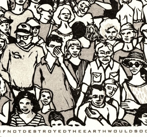
Though it’s a bit difficult to pick up in a scan, this detail from the final image shows the subtle range of values in the grey block. Compare the shirts on the man with the cap and glasses (no packing) and the man with his hand over his face (full 6 sheets of packing)
Read More...
I also wanted to try a variation on a technique used by Ilse Buchert Nesbitt of The Third and Elm Press. She uses different thicknesses of packing material to print a range of values from a single woodblock. There is a very good explanation of her process here.
Here is a simplified overview of the process I used:
1. I used ink wash on a proof of the key block to determine where I wanted gray, then transferred the image from the key block on to a second block and inked the grey areas. Everything that is not inked was then carved away.
2. Proofing: After carving, the grey block is printed (proofed) alone and with the key block. (You can also see that I later used the same sheet to proof the type) The grey in these proofs is all basically the same value, with some variation due to the fact that I was inking by hand and using a very transparent ink.
3. Preparing the Packing Material (Makeready): I laid a sheet of tracing paper over my proof and traced the areas where I wanted to adjust the value of the grey. I then assembled a stack of 6 sheets of tracing paper. Using my traced marks as a guide, I cut through all of the sheets where I wanted the lightest values (less impression), and through half the sheets for a middle value (moderate impression). The places where I cut away nothing receive the most impression and print as the darkest value.
Here is the finished packing laid over a completed print. The areas that show through are the palest shades of grey in the final image because they receive the least impression when printing.
4. Printing the Grey Block: These images show the grey block locked up in the press bed and the packing material positioned on the impression cylinder.
5. Once the grey block was printing consistently, I printed about 50 sheets. In the following days I added the key block and then the type. Each required separate inking and makeready. Accounting for losses due to registration problems and printing inconsistencies, this was just enough to give me a final edition of 25 prints.
Though it’s a bit difficult to pick up in a scan, this detail from the final image shows the subtle range of values in the grey block. Compare the shirts on the man with the cap and glasses (no packing) and the man with his hand over his face (full 6 sheets of packing)
Read More...