Velocipede Temporary Closing Poster
21/12/12 15:32 Filed in: Pellinore Press
I made this poster for Velocipede Bike Project to announce its temporary closing.
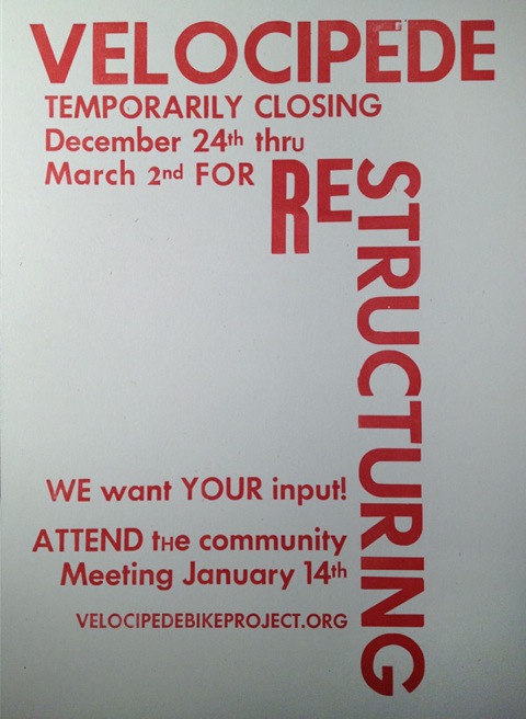
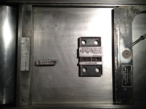
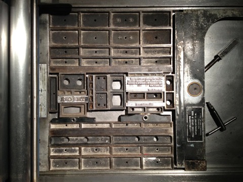
This poster represents several firsts. This was the first time I’ve used our wood type, combining it with type donated by some Velocipede Collective members (thanks!). It might also qualify as the first solely typographic piece I’ve printed. Finally, it’s the first time I’ve printed directly from a galley tray, a technique quite common in the press’ original usage.
The construction of the form improved my typesetting skills in regard to planning and problem solving. One difficulty proved to be the incompleteness of the fonts. I did my best to plan the distribution of upper and lower case so as to have enough of certain sorts (individual pieces of type), as well as stress important parts of the text. There are a few spots where I ran out and substituted other fonts, hopefully tastefully. As best I can determine, these fonts are all from the Futura family, or some variation thereof.
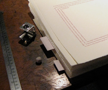
Lock-up was interesting and pretty easy. I locked the type into the galley tray, using magnets on one side, then just added furniture around the tray in the press bed until it was snug. In order to prevent any slipping of the form, the magnets were placed closest to the cylinder so that any force from printing would push the form against immovable furniture and not test the force of the magnets.
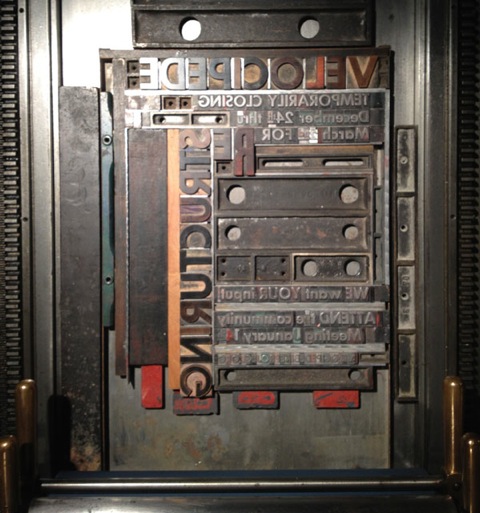
Because I was producing only 20 or so, it didn’t seem worthwhile to use the press’ inking system, requiring more cleanup as well as more time for makeready. Instead, I used a large brayer and a smaller one to ink areas where the large brayer would fall into the form. The less even inking seemed appropriate to the use of type that was itself uneven and, in some cases, physically damaged.
Read More...
This poster represents several firsts. This was the first time I’ve used our wood type, combining it with type donated by some Velocipede Collective members (thanks!). It might also qualify as the first solely typographic piece I’ve printed. Finally, it’s the first time I’ve printed directly from a galley tray, a technique quite common in the press’ original usage.
The construction of the form improved my typesetting skills in regard to planning and problem solving. One difficulty proved to be the incompleteness of the fonts. I did my best to plan the distribution of upper and lower case so as to have enough of certain sorts (individual pieces of type), as well as stress important parts of the text. There are a few spots where I ran out and substituted other fonts, hopefully tastefully. As best I can determine, these fonts are all from the Futura family, or some variation thereof.
Lock-up was interesting and pretty easy. I locked the type into the galley tray, using magnets on one side, then just added furniture around the tray in the press bed until it was snug. In order to prevent any slipping of the form, the magnets were placed closest to the cylinder so that any force from printing would push the form against immovable furniture and not test the force of the magnets.
Because I was producing only 20 or so, it didn’t seem worthwhile to use the press’ inking system, requiring more cleanup as well as more time for makeready. Instead, I used a large brayer and a smaller one to ink areas where the large brayer would fall into the form. The less even inking seemed appropriate to the use of type that was itself uneven and, in some cases, physically damaged.
Read More...
0 Comments
The Orb: 24 Hour Comic Cover
15/10/12 14:15 Filed in: Pellinore Press
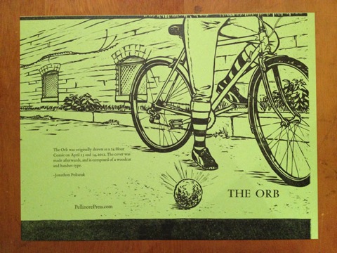
This post describes printing the type for the cover of The Orb, a 24 hour comic I’m making into a limited edition book. The interior will be printed digitally. You can see it here.
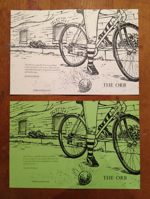
I’m going to start with a shot of the final type layout compared to a paste-up of the proof so it’s easier to envision the process. These show the covers trimmed and folded (it’s easier to see the fold on the white paste-up; it bisects the rear wheel). The type on the paste-up was printed as a group and then cut out and affixed to the proof to plan the composition. The typography on the green cover is nearly in its final position.
I neglected to take any shots of the woodcut being printed, so imagine that it has already occurred: a stack of covers awaits the second run for the type. Before removing the block from the press, I recorded measurements from the edges of the press bed to the approximate positions of the individual sections of type, based on my paste-up. I removed the block and all of the furniture, then placed the type sections according to the measurements I had taken. This shows the press bed, with the title on the left and the back cover text on the right. THE ORB is still secured with string in this picture.
From here, I added furniture to fill the space and quoins to lock the form. The press was inked and changes were made based on where the type actually printed. Eventually, the design was finalized and I focused on printing aesthetics. Here is the press bed as it appeared for printing. You may notice the lack of ink on the rollers and type. This is because, as usual, once I got involved in printing I forgot to take more shots and had to take one later, after the press was cleaned.
Here is the untrimmed cover. There are two unusual things about this sheet: it bleeds on two sides (left, bottom), and the right edge has a very small margin for grippers. The paper I wanted came in three sizes that would fit in our guillotine cutter, one of which was too small. The largest of the three was double the second size, which just meant more work trimming it down. The middle size left me a choice of easily getting one cover out of each sheet, with lots of waste/offcut, or being more precise and getting two. Obviously, I chose two. This meant squeezing the block as close to the grippers as possible and dealing with the bleeds. The bleeds weren’t a problem because the paper is thick enough that the areas of the block outside the paper were spaced away from the tympan enough so as not to print onto it.
This shot is a little washed out. The color and intensity is more accurately displayed in the first picture.
Read More...
Cyclist Paper Doll Variations and Completion
30/03/12 12:12 Filed in: Pellinore Press
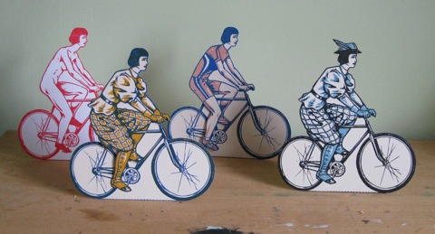
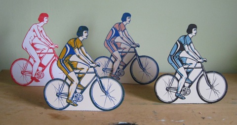
Before even completing the key block for the Cyclist Paper Doll, I scanned some proofs into the computer and played with some color variations. I had decided the piece would be in two colors, which, when layered in the printing process, would create a third, possibly something close to black. I chose a deep blue for the key block and was considering an ochre/orange for the second. I proofed the key block in a blue and then used watercolor to try colors for the second. As I planned to use the second color as both local color and shading/tonality, this made placement crucial. I was concerned that if I only used it as local color the overall piece would lack consistency.
I tried two versions of the ochre, one of which was so unpleasant when paired with the blue that I won’t show it. The ochre below was the better one, but I was disconcerted with the dark green created when it layered with the blue. So, I tried a magenta with the blue (not shown, too horrible for sensitive viewers!) and a salmon. None of these were satisfying in all the costumes, and I finally conceded and tried black, an old standby, paired with a medium blue. This was much better overall, though I felt a little defeated by my lack of success with two real colors. Below are some of the variations. I will be listing the Cyclist on Etsy soon if you want to see detailed, cleaner shots of the final black and blue version.
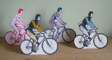
There are hats/helmets for each costume, but I only bothered to include the one for the bloomers in these shots, because it really completes it.
Read More...
I tried two versions of the ochre, one of which was so unpleasant when paired with the blue that I won’t show it. The ochre below was the better one, but I was disconcerted with the dark green created when it layered with the blue. So, I tried a magenta with the blue (not shown, too horrible for sensitive viewers!) and a salmon. None of these were satisfying in all the costumes, and I finally conceded and tried black, an old standby, paired with a medium blue. This was much better overall, though I felt a little defeated by my lack of success with two real colors. Below are some of the variations. I will be listing the Cyclist on Etsy soon if you want to see detailed, cleaner shots of the final black and blue version.
There are hats/helmets for each costume, but I only bothered to include the one for the bloomers in these shots, because it really completes it.
Read More...
Cyclist Paper Doll
11/01/12 19:48 Filed in: Pellinore Press
A while ago I tried making a paper doll, but I spent so much time bringing each costume to a refined stage of completion that I lost my impetus by the time it was ready to be transferred to the actual woodblock. I did, however, learn a lot about engineering the pieces.
This time, with a different theme, I only did a few sketches of the cyclist and only drew a single test costume initially. I started drawing on the block earlier in the process, beginning with the cyclist on her bicycle. On the block, you can see the ink on the uncarved portion from the edge of the brayer. With the proof in hand, I used tracing paper to plan the costumes. This way, any slight changes that occurred from carving would be incorporated into the designs.
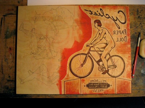
The computer was very helpful at this stage, allowing me to scan in the costumes, make the lines darker, and print multiple copies to cut out and experiment with. I then made any alterations on the tracing paper costumes directly because they could just be flipped over (pencil side down) and used like carbon paper to transfer the designs to the block. The resulting image would be backwards, as it should be on the block!
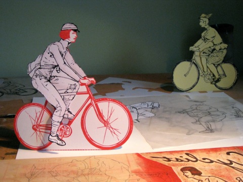
Here is a cut out proof wearing a computer printout “urban cyclist” costume. In the background is a prototype sketch wearing Bloomers from the 1890s. This red is definitely not one of the final colors!
Read More...
This time, with a different theme, I only did a few sketches of the cyclist and only drew a single test costume initially. I started drawing on the block earlier in the process, beginning with the cyclist on her bicycle. On the block, you can see the ink on the uncarved portion from the edge of the brayer. With the proof in hand, I used tracing paper to plan the costumes. This way, any slight changes that occurred from carving would be incorporated into the designs.
The computer was very helpful at this stage, allowing me to scan in the costumes, make the lines darker, and print multiple copies to cut out and experiment with. I then made any alterations on the tracing paper costumes directly because they could just be flipped over (pencil side down) and used like carbon paper to transfer the designs to the block. The resulting image would be backwards, as it should be on the block!
Here is a cut out proof wearing a computer printout “urban cyclist” costume. In the background is a prototype sketch wearing Bloomers from the 1890s. This red is definitely not one of the final colors!
Read More...
After Darwin: Intermediate Forms - TYPE!
23/12/11 09:18 Filed in: Pellinore Press | After Darwin
I was able to edition the type for my final “Darwin” print yesterday. The printing went surprisingly smoothly once I was able to adjust all the spacing to my liking and lock up the form. All that remains now are a few adjustments to the wood engraving and one more day of printing. I’m very excited about how this one is turning out.