Gradation woodcut 2nd color
21/10/10 13:53 Filed in: Pellinore Press
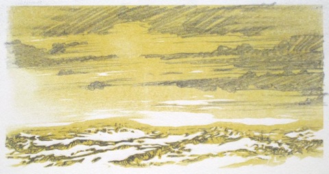
Initially, I planned to use a slate blue for the second color of the reduction cut, as I thought it might compliment the yellow. However, I wasn’t very pleased with my initial sketch. I started drawing on a proof with pencil, partly because it was easier than getting out the watercolors, but also with the hope of achieving more detail. After drawing a while, I realized that the graphite color worked nicely with the yellow, but the overall image was still rather boring.
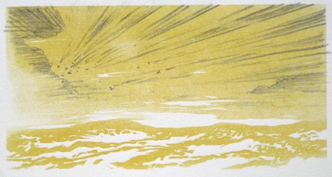
Searching for something a little livelier, I started reading some dreams I had recorded. One contained a vast landscape into which were plummeting meteorites that turned out to be small metal shapes reminiscent of insects. I had also been reminded recently of the impact/explosion of a meteorite in 1908 in Tunguska, Russia (check it out, pretty interesting). Here is the sketch for the sky inspired by the dream and the event in 1908.
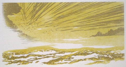
This is the final print. I’m overall pleased considering it began as an experiment. Note that because most of this is linear, it prints much more consistently even though it is the same sanded block as the initial yellow printing. The sky is still a little paler than the foreground and I retained the handling of the landscape from the first sketch. It’s titled The Event.
Read More...
Searching for something a little livelier, I started reading some dreams I had recorded. One contained a vast landscape into which were plummeting meteorites that turned out to be small metal shapes reminiscent of insects. I had also been reminded recently of the impact/explosion of a meteorite in 1908 in Tunguska, Russia (check it out, pretty interesting). Here is the sketch for the sky inspired by the dream and the event in 1908.
This is the final print. I’m overall pleased considering it began as an experiment. Note that because most of this is linear, it prints much more consistently even though it is the same sanded block as the initial yellow printing. The sky is still a little paler than the foreground and I retained the handling of the landscape from the first sketch. It’s titled The Event.
Read More...
0 Comments