Gradation Woodcut
10/08/10 13:50 Filed in: Pellinore Press
Although I enjoy the graphic qualities of woodcuts, I miss the softness and tonality of my monotypes. I wondered if there was some way to bring some of this to the woodcuts. I had undertaken little experiments with shaving very small parts of the block, but tools remove too much material without enough control. I decided to create a practice block and sand parts of it. I learned more recently that Rockwell Kent, a 19th century wood engraver, would sand portions of his blocks where he planned to have thin lines or details. In this way they wouldn’t receive impression they didn’t need (thin lines will be the first to print black).
Since the tonality is in the block itself, printing the tone should be repeatable enough to create an edition, given a press with small tolerances and careful monitoring of the ink. With its adjustable bed, the 15-21 allows for very slight changes in impression without having to make underlays or overlays and worked well to fine tune the tone while maintaining some blacks.
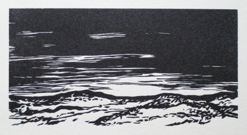
Here is the proof from the block after carving, but without any sanding.
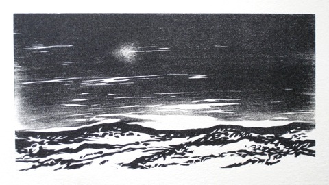
This is after several timid rounds of sanding and proofing, stripping the block, sanding and proofing… Many small details, the shallower cuts in the wood, disappear the more the block is sanded.
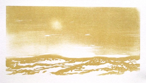
There were some interesting things happening, but it wasn’t there yet. My monotypes were in color, which gave them a softer feel, so I tried printing the landscape in a muted hue. I think at this stage I might still prefer the unsanded proof, but I want to take it to its conclusion.
I think it needs a second color, so I’m going to continue with it as a reduction cut.
Since the tonality is in the block itself, printing the tone should be repeatable enough to create an edition, given a press with small tolerances and careful monitoring of the ink. With its adjustable bed, the 15-21 allows for very slight changes in impression without having to make underlays or overlays and worked well to fine tune the tone while maintaining some blacks.
Here is the proof from the block after carving, but without any sanding.
This is after several timid rounds of sanding and proofing, stripping the block, sanding and proofing… Many small details, the shallower cuts in the wood, disappear the more the block is sanded.
There were some interesting things happening, but it wasn’t there yet. My monotypes were in color, which gave them a softer feel, so I tried printing the landscape in a muted hue. I think at this stage I might still prefer the unsanded proof, but I want to take it to its conclusion.
I think it needs a second color, so I’m going to continue with it as a reduction cut.
0 Comments