After Darwin: Intermediate Forms - TYPE!
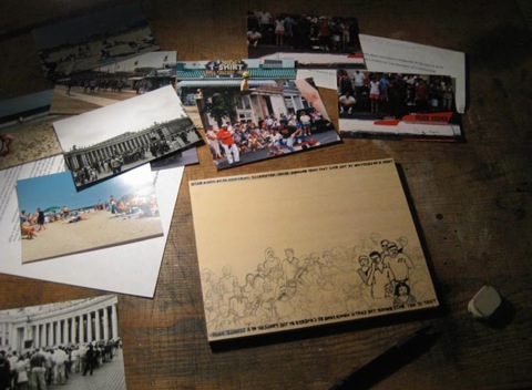
After Darwin #4 - Progress Photos
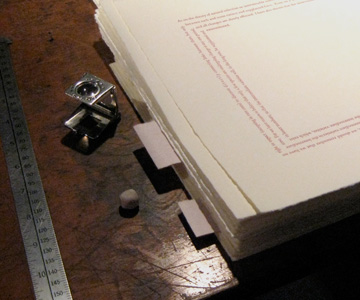
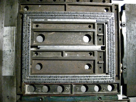
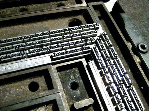
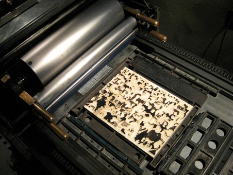
Setting the Type: These shots show the handset type locked up in the bed of the press. I’ll still need to make some spacing adjustments so that the type flows nicely around the corners.
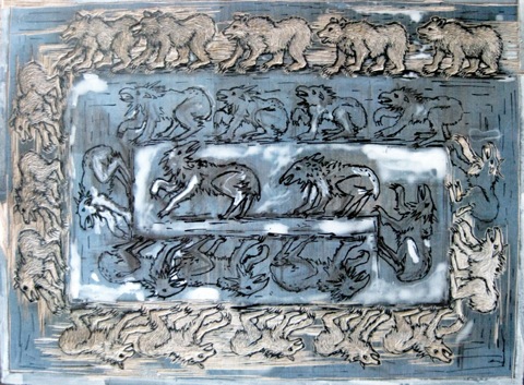
Engraving the Block: Once I finish carving, this large wood engraving will be printed in the center of the type border. The blue areas are where I toned the block to make it easier to see what’s been carved.
Proofreading Challenge
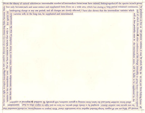
The first 3 people to inform me that they’ve proofread the passages will receive a small prize. The first person to find each mistake (if any) will receive a slightly larger prize.
Thank you!
-Ursula
ursula@pellinorepress.com
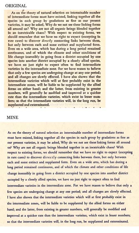
Once I’m sure that I’ve made no mistakes, I will be setting the type in a spiral. It will form the border for a 6x8” wood engraving. Below is a paste-up I’ve made to help figure out line lengths.
After Darwin: The Valve House
The biggest challenge in the printing of this image was the registration, particularly of the black (which is actually a very dark green) with the preceding colors. Partway through I realized that I could have done the entire print as a reduction cut, meaning that the same block is progressively carved and printed, lightest color to darkest. As it is, the pale green/gray and middle green are a reduction. The image below shows the successive layers.
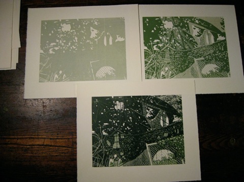
The colors I originally devised were not going to work as a reduction, so I cut a key block and worked from there. One aspect of the present print which would have been impossible as a reduction, is the places where the middle green is cut away and the black sits only on the green/gray, such as in the subtle roof structure discernable in the center of the image. Read More...
After Darwin #3
At this time he was recommended by a teacher at Cambridge for a position on board H.M.S. Beagle, which, under Captain Robert FitzRoy, was to conduct a survey voyage of distant parts as it circled the world. The exact nature of Darwin’s position is debatable, though it includes one or both of the following parts: as geologist, and/or as gentlemen companion to the captain (someone of his social class to share meals with, etc.). The ship already had a naturalist, but he quit after just four months and Darwin took his place.
In The Voyage of the Beagle Darwin is not offering evidence to support a view, but is collecting data, making observations, and sharing anecdotes. Of course, what he observes is quite likely crucial to the subsequent development of his theory of “descent with modification.”
It was difficult for me to decide what to do for this print at first. Certainly, amazing scenes, geologic events, animals, and people are described on nearly every page. But, all that he describes is far away and it seemed ridiculous to use vicarious sources/photographs to draw from. What kept striking me were his experiences. So, whatever I did had to be within my experience. I began to examine the recurrent themes in The Voyage, rather than particular animals or places. Darwin observes and surmises on the way things change with time, particularly on a geologic scale, so I decided to create something from my own experience that reflects the passage of time.
I find it interesting that there is more “nature” in the city of Baltimore than one might assume, and that its incursion is fairly rapid if lots and structures are neglected: overgrown yards, rotting porches, crumbling walls, plants growing from gutters where a little organic material has collected. Although these are conditions of disuse, apathy, or neglect, there is a beauty to them. Perhaps there is something hopeful to seeing the vegetation unfurl from a seemingly hostile environment, or the tendency for time to imbue things with character.
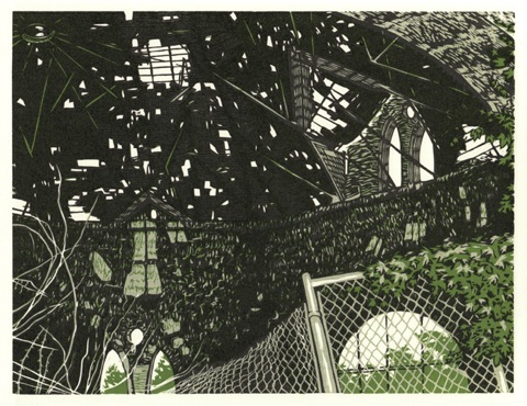
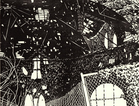
I decided to use the Clifton Park Valve House to represent these ideas. Located on Saint Lo Drive, it was constructed in 1887 to control the flow of water from Lake Montebello, which serviced homes and businesses to the south. An octagonal building with architecture befitting a far grander purpose, the Valve House has seemingly been derelict for many years. A chain link fence, now sagging, and concrete traffic barriers, have been placed around the building, further transforming it.
Initially, I planned to divide the block into three panels to show different aspects of the building, as follows.
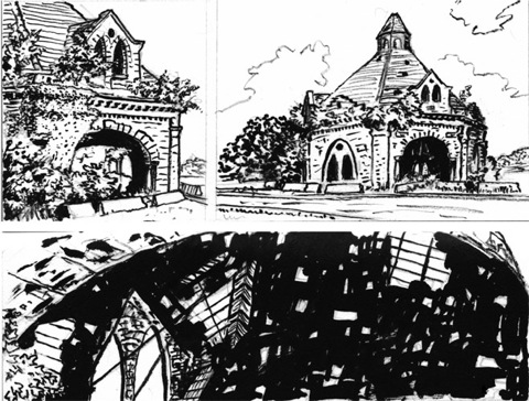
But I decided that I wanted to focus on the more abstract view of the interior, and particularly the crumbling ceiling, which filters light like the canopy of a forest. Here is a proof from the key block, to which I will add a second in reduction cut, to more colors and clarify certain parts.
Read More...
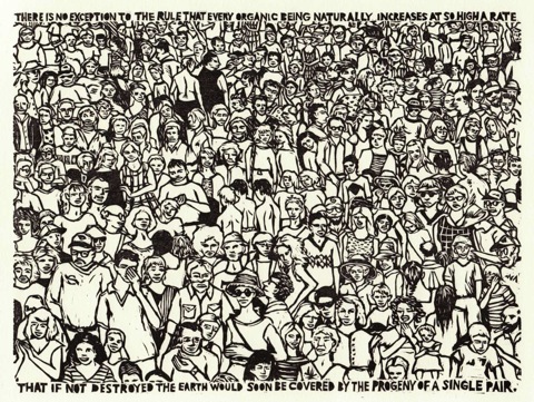
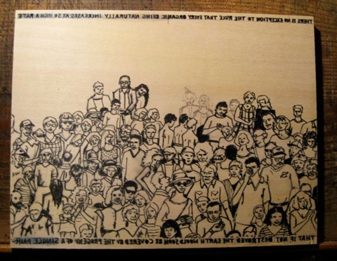
There is No Exception to the Rule: Finished Print
In Chapter Three of The Origin of Species, Darwin writes:
There is no exception to the rule that every organic being naturally increases
at so high a rate, that if not destroyed, the earth would soon be covered by
the progeny of a single pair.
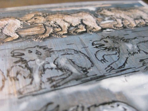
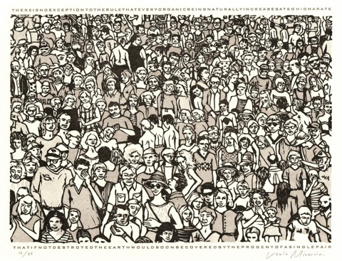
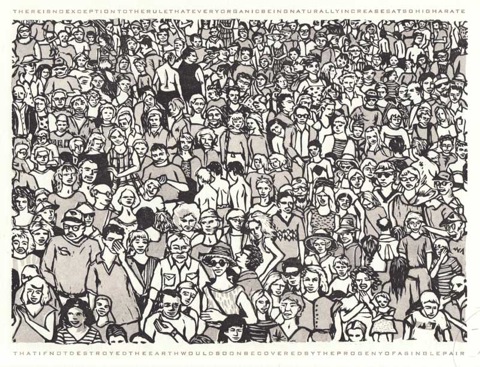
Darwin goes on to describe the relatively short span of time it might take a slow breeding animal like the elephant to become densely populated if every individual survived and reproduced. My first idea for a print was to depict a naturally solitary species, such as the polar bear, so overpopulated as to fill the picture plane with a solid mass of bodies.
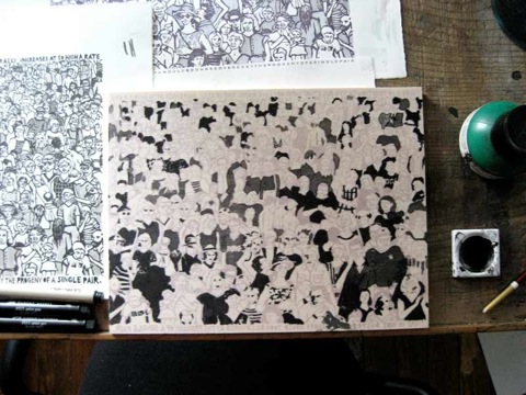
I eventually chose humans as my subject, since we seem to have the best chance of covering the earth with our progeny. (Darwin states that “even slow-breeding man has doubled in twenty-five years.”) Drawing from snapshots taken at the beach, at public events, and at gatherings of family and friends I created a crowd of figures packed onto a seven by nine inch wood block. In some respects the image is playful. Looking over the faces in the crowd might bring to mind the “Where’s Waldo” books. In the process of drawing, carving, and printing the blocks, I developed feelings of affection for this group of figures. But, although the figures may be charming, I would not wish to be part of this crowd.
The quote printed along the edges of the image is intended to balance its lighter and more playful qualities. The text adds a contrasting element to what otherwise could simply be a depiction of people at a county fair or a sporting event. The text is deliberately difficult to read so as not to completely dominate and shape a viewer’s first impression of the image. It is my hope that the print will be appreciated as an object of beauty, as an entertaining diversion, and as a more sober reminder that there are limits to the amount of growth that can or should be sustained.
-Ursula West Minervini
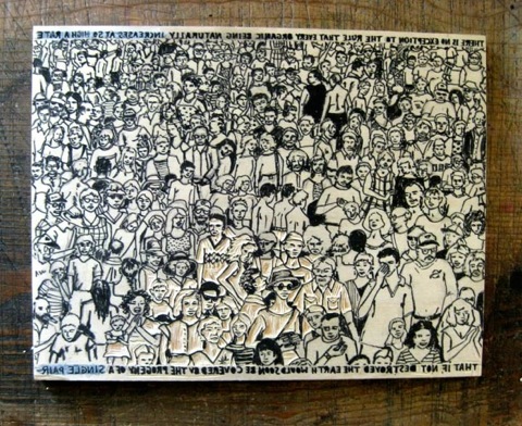
There is No Exception to the Rule – Adding a Second Block
I also wanted to try a variation on a technique used by Ilse Buchert Nesbitt of The Third and Elm Press. She uses different thicknesses of packing material to print a range of values from a single woodblock. There is a very good explanation of her process here.
Here is a simplified overview of the process I used:
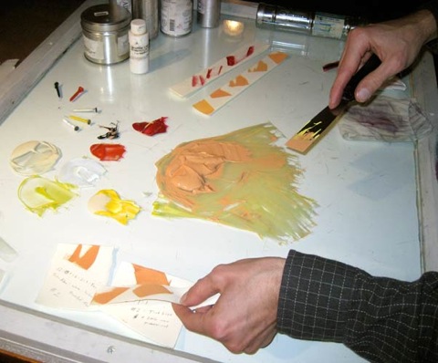
1. I used ink wash on a proof of the key block to determine where I wanted gray, then transferred the image from the key block on to a second block and inked the grey areas. Everything that is not inked was then carved away.
2. Proofing: After carving, the grey block is printed (proofed) alone and with the key block. (You can also see that I later used the same sheet to proof the type) The grey in these proofs is all basically the same value, with some variation due to the fact that I was inking by hand and using a very transparent ink.
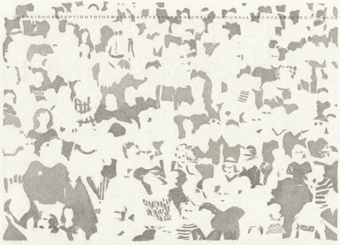
3. Preparing the Packing Material (Makeready): I laid a sheet of tracing paper over my proof and traced the areas where I wanted to adjust the value of the grey. I then assembled a stack of 6 sheets of tracing paper. Using my traced marks as a guide, I cut through all of the sheets where I wanted the lightest values (less impression), and through half the sheets for a middle value (moderate impression). The places where I cut away nothing receive the most impression and print as the darkest value.
Here is the finished packing laid over a completed print. The areas that show through are the palest shades of grey in the final image because they receive the least impression when printing.
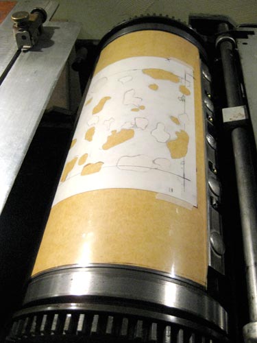
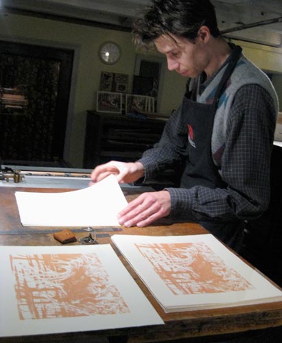
4. Printing the Grey Block: These images show the grey block locked up in the press bed and the packing material positioned on the impression cylinder.
5. Once the grey block was printing consistently, I printed about 50 sheets. In the following days I added the key block and then the type. Each required separate inking and makeready. Accounting for losses due to registration problems and printing inconsistencies, this was just enough to give me a final edition of 25 prints.
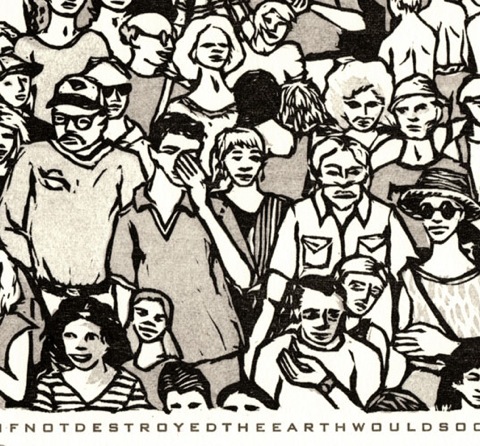
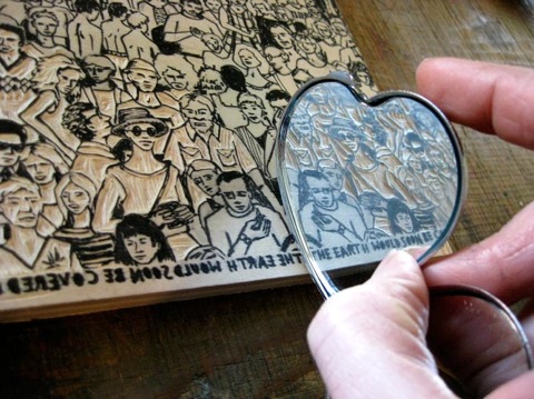
Though it’s a bit difficult to pick up in a scan, this detail from the final image shows the subtle range of values in the grey block. Compare the shirts on the man with the cap and glasses (no packing) and the man with his hand over his face (full 6 sheets of packing)
Read More...
After Darwin: No Exception to the Rule
After Darwin: No Exception to the Rule
I was inspired by a line from The Origin of Species which reads:
“There is no exception to the rule that every organic being naturally increases at so high a rate, that if not destroyed, the earth would soon be covered by the progeny of a single pair.”
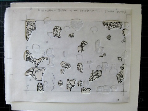
My initial reaction to the text was to think of large groups of animals. I considered depicting normally solitary creatures like polar bears packed into a large mass to illustrate the idea that any creature, if unchecked, can quickly saturate its environment. I eventually decided to create a print with humanity as its subject. In the past year I’ve been looking at James Ensor. Ensor’s prints and drawings of crowd scenes were a definite influence.
This first image shows the early stages of the drawing. I work in pencil first, then ink the lines. You can see some of my reference photos in this shot as well.
Here the drawing is about half finished. It became more challenging as the work went on to fill the space with ever smaller figures.
At last the drawing is finished!
I decided that the print should include the text, which must be written and carved backwards in order to be right-reading when the block is printed. I used a mirror to double and triple-check that I’d transcribed the text correctly.
-Ursula Minervini, 3/2/2011
After Darwin: An Organ Injurious
Here I am printing the orange block. The print above the stack of finished prints is the first print I was satisfied with (density of color, color choice, amount of ink etc.). I keep it there to refer to as I print to maintain consistency. If you look closely, you will see some earlier color trial proofs in the background.
The key block proved more difficult, primarily due to inconsistencies in the block’s thickness. Learning from the color problems printing the orange, I mixed the purplish black darker than my swatch. I judged correctly and the color was not problematic, though getting the block to print evenly was. I had a frustrating enough time that I didn’t bother taking any pictures, but I’m pleased with the final results. The finished prints will be signed and shipped out to our print subscribers this week in order to arrive in time for Christmas.
 Read More...
After Darwin: An Organ Injurious
Part of what attracts me to On the Origin of Species is that, despite Darwin’s cohesive, developed idea of natural selection, scientific fields which would supply some of the missing pieces, such as genetics, were nascent at best. As such, there is a sense of the explorer as author about the work, complete with wonder, epiphanies, and stumbles. Darwin struggled to find a catalyst for the variation of traits that would be inherited based on the mechanism of natural selection. In the chapter on Laws of Variation, Darwin cites use and disuse as probable catalysts. He says, speaking of beetles inhabiting the island of Madeira:
For during thousands of successive generations each individual beetle which flew least, either from its wings being ever so little less perfectly developed or from indolent habit, will have had the best chance of surviving from not being blown out to sea; and, on the other hand, those beetles which most readily took to flight will oftenest have been blown to sea and thus have been destroyed.
Darwin later states:
Again, an organ useful under certain conditions, might become injurious under others, as with the wings of beetles living on small and exposed islands; and in this case natural selection would slowly continue to reduce the organ, until it was rendered harmless and rudimentary.
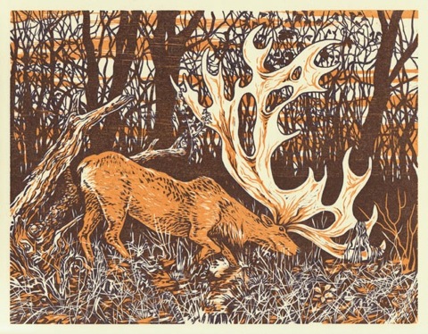
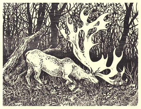
This led me to think of the antlers of deer, employed by males of many species as an attraction to females. At what point is the size of the antlers inimical rather than beneficial? It was once believed that the Irish Elk (more accurately Giant Deer) became extinct due to the large size of its antlers.
Here is a proof of the first of two blocks which will compose this print. This is not the final color.
 Read More...